
Case study · NETMA
How we got WordPress off NETMA's site and kept the look the brand was built on.
bylo 214 kB
the smoke effect in the hero: from the Slider Revolution plugin to our own code
- 63 kBof JavaScript on homepage load
- 4 × 100Lighthouse on mobile, every category
Everything we claim here you can check for yourself in your browser's dev tools.
The brief
A marketing agency's website isn't a business card. It's the work itself.
NETMA does performance marketing, social media and branding. It builds brands for other people. Its own website is the first thing a prospective client sees, long before they pick up the phone.
On a normal project, you defend a decision with expertise. Here the other side has it too — and the last excuse falls away. Anything we can't justify gets spotted immediately. Premium doesn't mean gloss here. It means every choice holds up.
And then there's the part worth saying out loud: the same people stand behind Inflexion and NETMA. We're not writing about someone else's project, we're writing about our own house. There's no hiding behind what the client asked for — here we asked for it ourselves, and then had to justify it to ourselves.
The starting point
The brand outgrew its own presentation.
NETMA's site ran on WordPress. The first version was simple: headline on the left, neon chart on the right. The smoke hero came years later, and it wasn't a given — Slider Revolution is a paid plugin you buy for exactly this kind of effect. From then on, the brand leaned on it.
That only became apparent once we measured it. The hero alone cost over 250 kB of JavaScript and fonts and took 2.6 s to render. And it wasn't just the hero: the header and the client carousel came from the same plugin, so on a phone even parts of the page that had nothing to do with effects were slow to load.
The brief wasn't to design a new site. It was to rescue the existing one. Without a single concession on how it looks.
Then and now
Two leaps. Only one of them shows.
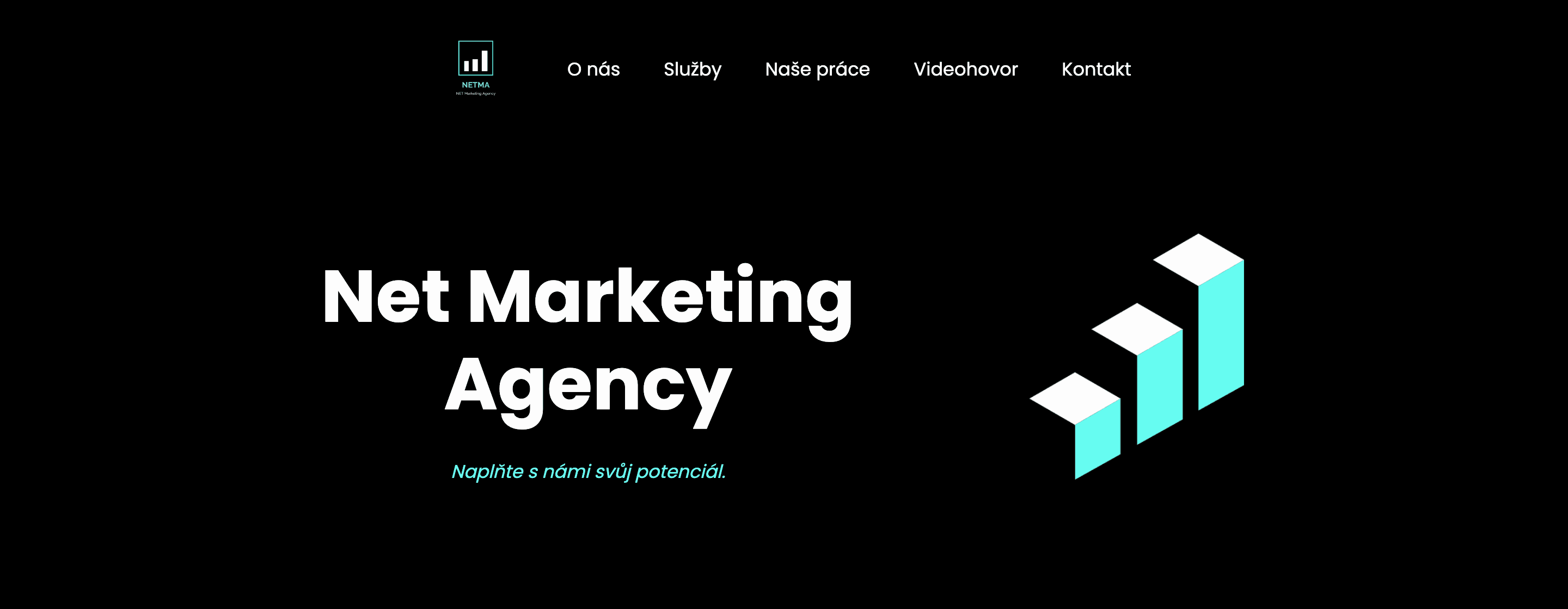
Stage 01The first version — headline left, neon chart right
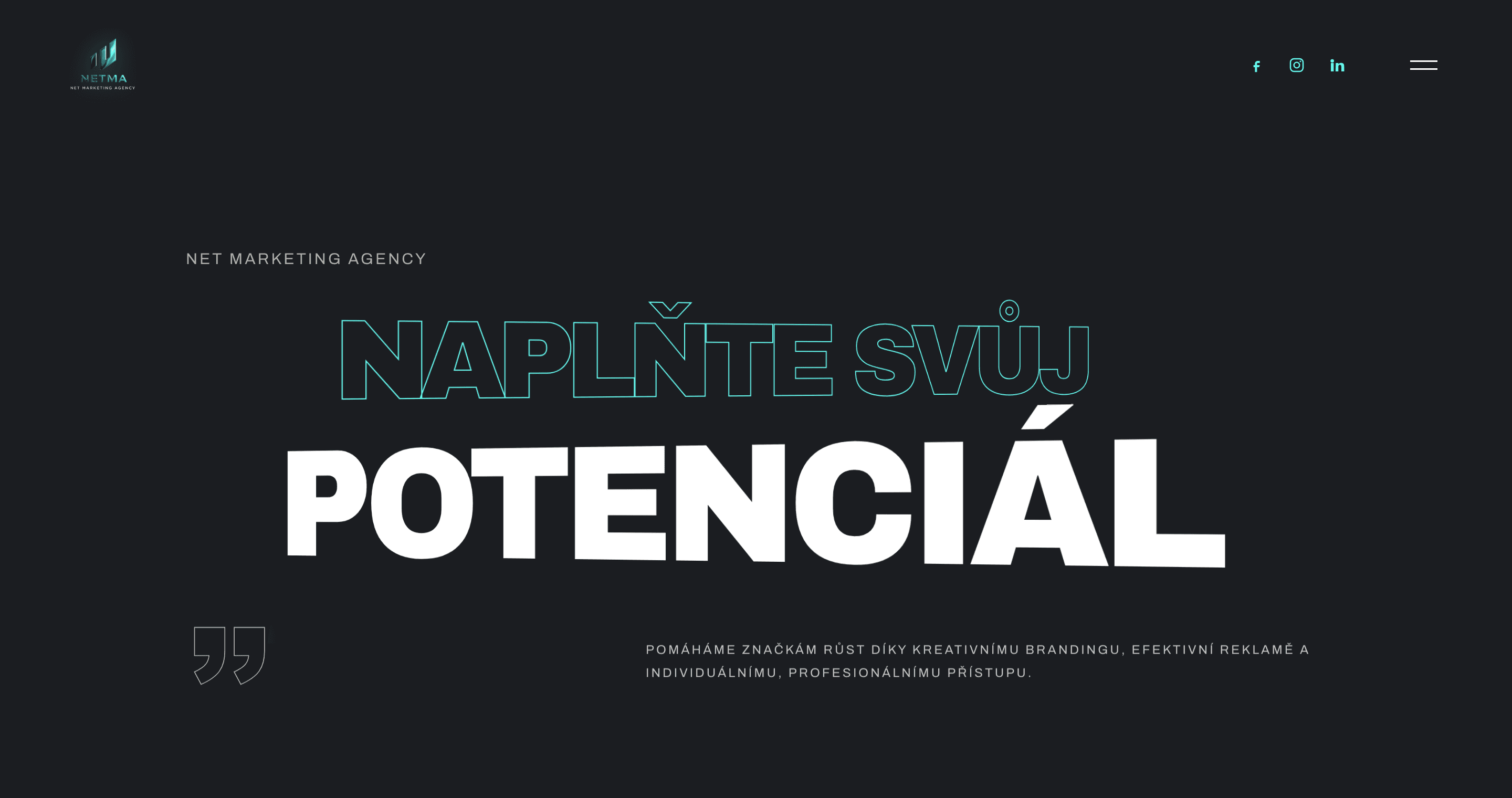
Stage 02WordPress with Slider Revolution — the smoke hero
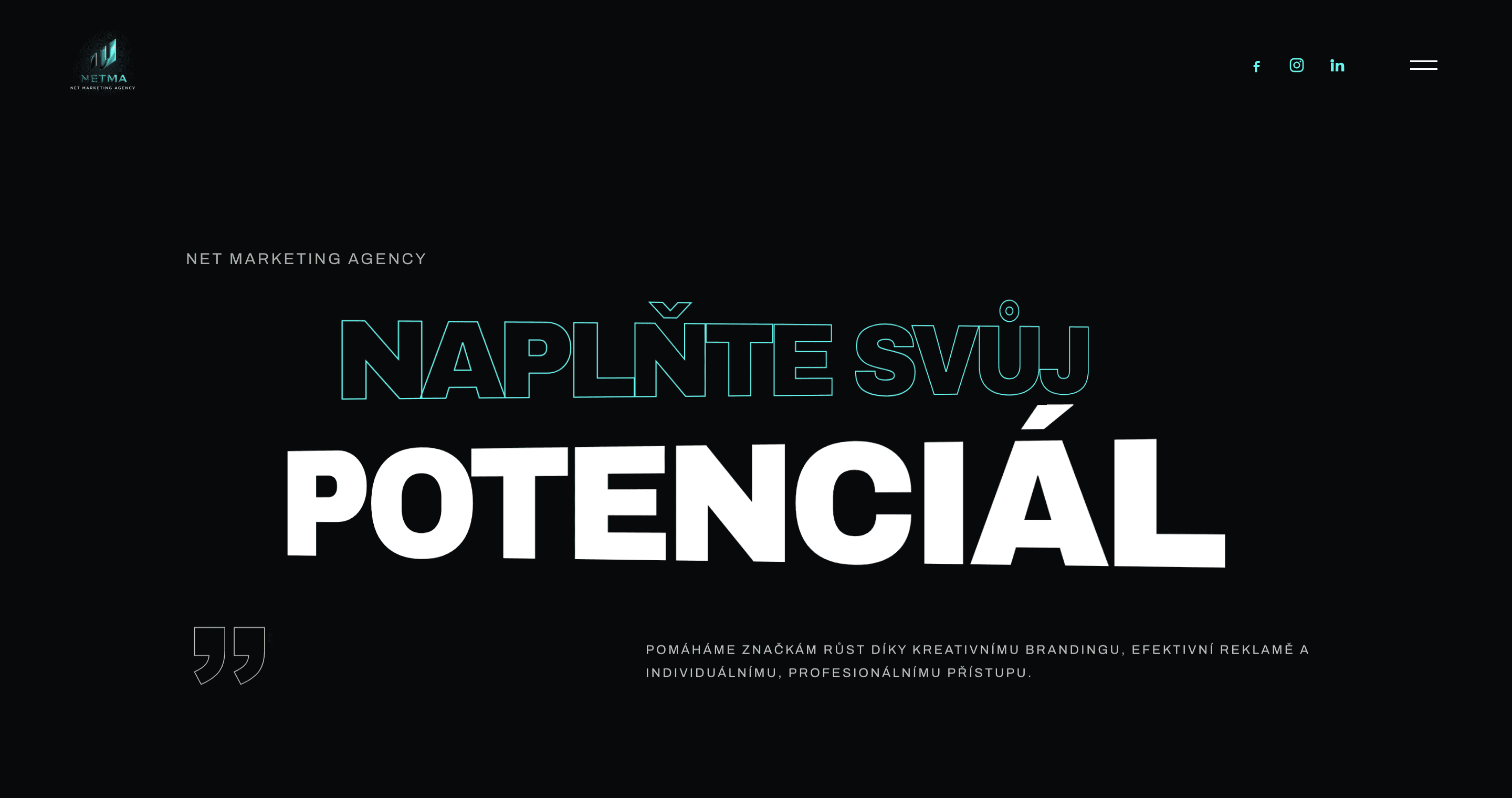
TodayOur own code — composition unchanged, background back to black
#1b1d21#08090b
Between the first version and WordPress with Slider Revolution there is a real visual leap. The smoke hero became the brand's signature.
Between that one and today, almost none — and that is the brief, delivered. NETMA wanted to keep the hero. What changed is what sits behind it.
- Code behind the effect
- 214 kB20 kB
- Hero render
- 2.6 ssmooth
Phase 01Visual language
Premium isn't gloss. It's the confidence to leave space empty.
The sections below the hero were each built separately, and it showed: three different blacks, two names for the same mint, and fonts pulled from three separate Google Fonts links. Each section looked fine on its own. Side by side they read as four different websites.
We unified it into one material: Archivo Black for headlines, Archivo for body text, a single background and mint as the only accent. The fonts sit on NETMA's own domain, with no request to Google.
The case studies have their own subsystem: a different typeface, an even darker background, and gold only where it belongs to the client's identity. It isn't a mood. It's a system that can justify every colour on the page.
Podklad
Mint
Type
Case studies
Phase 02The hero
The brief was: make it look the same.
NETMA wanted to keep the hero. They liked it and people associated it with the brand. The task wasn't to invent a new one, but to refine what was there, rewrite it from a plugin into our own code, and above all make it fast. That the new version looks almost identical to the old one isn't a shortfall. It's the brief, delivered.
The smoke was powered by Slider Revolution's fluid dynamics add-on and the WebGL layer it needed — 214 kB of third-party code in total. We wrote our own Navier–Stokes solver on WebGL2 at 20 kB, 5.5 kB compressed. We didn't invent the parameters, we copied them from the plugin's own panel: curl 15, density dissipation 0.69, pressure 0.75. It isn't an imitation. It's a transfer.
That's why the usual before-and-after pair doesn't work here: you'd be looking at two nearly identical images. The difference is elsewhere — the old hero stuttered and took 2.6 s to load, the new one runs smoothly.
The smoke stayed. The plugin didn't.
Slider Revolutionpanel pluginu
fluid.jsour code
- Curl15
CURL:15 - Radius15
SPLAT_RADIUS:0.15 - Density69
DENSITY_DISSIPATION:0.69 - Velocity96
VELOCITY_DISSIPATION:0.96 - Pressure75
PRESSURE:0.75 - Color 1#66fcf1
colorA - Color 2#8e8e93
colorB - Color Change Timed1
COLOR_CYCLE:1.0
Phase 03Motion as material
Animation that never stops isn't an effect. It's noise.
In the hero, a mint orb replaces the cursor, in difference blend mode: the text inverts beneath it, so the headline stays readable even under the orb. Once the pointer leaves the hero, the orb dissolves into a plain cursor. A single script handles all of it; the page originally ran three independent cursor systems, each from a different fragment.
The cards tilt towards the pointer. On touch, only after a 100 ms hold within a 10 px radius, so the tilt doesn't fight the scroll when someone is merely dragging a finger down the page.
And then the discipline nobody sees but everybody feels. The smoke stops when it's off screen. Permanently promoted layers dropped from 21 to 8. On phones, all 12 blurred layers are gone. Motion here is rationed, not handed out.
Demo · the NETMA hero
Text under the orb inverts. It stays readable.
WorkContact
Phase 04What we cut
We cut the third promise. Three clickable numbers took its place.
The About section carried three marketing promises. Promises are easy to write and even easier to skim. We replaced the third with three numbers from NETMA's actual work: 47.6 million in revenue, ROAS 82, a click at 1.15 CZK. Each leads to the study where the calculation is written out.
The second cut points inward. The cards offered icons: a swallow, a target, a lightbulb. They looked good and meant nothing — every one of those metaphors would have fitted any of the three cards. In their place stand the numerals 01–03, picking up the numbering of the services one section below.
Decoration that carries no information is just noise with good taste.
- 01We understand your business.
- 02Data, not impressions.
- 03We have results that speak for themselves.
Phase 05Construction
WordPress out, static in.
The new site is plain HTML with no build step. The only server-side parts are two functions: the site scan and the sign-up submission. On load, the homepage pulls 63 kB of JavaScript including the entire smoke solver; the hero alone used to cost over 250 kB.
The move couldn't break anything. Other websites link to the old case-study addresses, so ten rules redirect them to the new ones with a permanent 308. The links keep working and search engines know where the content moved.
No plugin to update. No database. No build to maintain.
The original hero, on its own
the plugin's JavaScript and fonts
Today's homepage, in full
of which 20 kB is our own smoke solver
On the left is the hero alone, on the right the whole page — the comparison is deliberately stacked against us. The fonts (88 kB) come from our own domain, and ten old WordPress addresses point to the new ones with permanent redirects.
Proof
A number without a calculation is marketing. A number with one is proof.
Both case studies on NETMA's site rest on a single rule: for every number, you can see where it came from. Moje zlato doesn't state 47.6 million as a claim, but as a sum: 37.01 from Meta and 10.6 from Google. And right beside it, it admits what can't be added up — organic profiles have no revenue attributed to them, and putting a number there would be an estimate, not a measurement.
That rule turned on us as well. On the second study, the page claimed a cost-per-click of −1104 %. You can't reduce a cost by more than a hundred percent: it was a click twelve times cheaper, dressed up as a percentage. For CTR we traced the source and corrected the market average — everywhere that number appeared, including the social sharing image.
We didn't find the error in the data. We found it in numbers on the page that wouldn't add up.
Moje zlato · attributed revenue
Organic profiles and branding have no revenue attributed to them. Putting a number there would be an estimate, not a measurement — and the sum would stop being verifiable.
Oprava · cena prokliku
Yet the page stated −1104 % — you can't cut a cost by more than a hundred percent. It isn't a typo in the data, it's the wrong unit: a multiple passed off as a percentage.
Acquisition
We didn't want to ask for a call before giving something first.
The header buttons led to booking a call — in other words, “give us half an hour”. We turned it around. A visitor enters their website address and the server actually crawls it: looking for analytics and advertising tags, consent banners and SEO basics. The output streams live, line by line, as it arrives from the server. In about a second you have a score out of nine, and only then do we ask whether you'd like to work together.
The tool has one rule of honesty: it never says “you have no pixel”, always “we didn't find one”. Tracking injected at runtime or server-side isn't visible in the page source, and passing that off as a finding would be lying with good intentions.
And a detail that sells better than design in B2B: the scan fetches an address typed in by a stranger, which makes it a textbook attack target. It rejects credentials in the URL and, only after resolving the hostname, rejects the internal network too: loopback, the cloud metadata address, private ranges, and IPv4 wrapped inside IPv6.
A deliberate loss
The site has no cookie banner. A marketing agency gave up its own retargeting for it.
Since January 2022, writing an identifier into a browser in the Czech Republic requires consent. For a website that means a choice: either a consent banner and retargeting with it, or neither. NETMA chose a clean first impression — and with it, the fact that no marketing identifier is written into the browser at all.
That doesn't mean the site isn't measured. Traffic is counted straight away, Google Analytics loads only after the first interaction and runs with consent denied, so it sets no identifiers of its own. Until you move, the page pulls nothing from a third-party domain.
The price is real: conversions in Ads are incomplete and there is no Meta Pixel on the site. It was a deliberate choice, not an oversight.
Craft
The site seemed fine. The audit found a screen reader was getting a broken tree on mobile.
The services switcher is a set of tabs on desktop. On a narrow display the panel moved inside the tab list, where only tabs belong. A screen reader was then handed a structure that made no sense. The fix wasn't to add an attribute. It was to admit that on touch these are no longer tabs, and turn them into an accordion.
Just as quietly, the missing landmark around the main content was added, three contrasts were corrected, and the company number in the footer went from 2.65 to 4.66 : 1, above the WCAG AA threshold. Client logos converted to WebP dropped from 474 to 142 kB.
Beneath all that sits a layer nobody will ever see: server functions, the form sending through a verified domain, security headers and cache rules. Mobile now scores 100 in all four Lighthouse categories, desktop 99 across three consecutive runs.
- Contrast of the company number in the footer
- z 2,65na 4,66: 1
- Client logos (WebP)
- z 474na 142kB
- Blurred layers on mobile
- z 12na 0
- Permanently promoted layers
- z 21na 8
- Height of the DNA section on mobile
- z 1575na 1063px
Lighthousemobil 4 × 100desktop 99
In closing
If we couldn't do it for our own sister agency, we shouldn't be selling it.
The site has been live since the turn of August and September. It looks the way NETMA wanted it — the smoke in the hero stayed, the visual language stayed, the header stayed. What changed is what you can't see: the page loads with a fraction of the original code and stopped stuttering on phones.
Most of the craft went into the two case studies. They share a skeleton — hero, summary figures, phase spine, roadmap — and each carries the rest on its own: six panels that appear nowhere else on the site. Every job has different data, and that data asks for a different visual, not a recoloured template.
So the result of this work isn't in a table. It's in how the site behaves when someone arrives — nothing jumps, nothing waits on a plugin, nothing pops up over the content. For an agency whose own website is the clearest sample of its work, that is exactly what counts.
Looks the same. Behaves nothing like it.
Method
What you won't find in this study.
Prices, the scope of the engagement, or the client's internal figures. Everything else (file sizes, scores, redirects, form behaviour) you can verify yourself at www.net-ma.cz, in any browser's developer tools.
Want to be our next case study?
Tell us about your project, or first work out what a system of your own would save you.