
Case study · Severka mountain enclave
How we kept every piece of content Severka had built up over the years and rearranged it around the way a guest actually decides.
one accommodation offer
four cottages, each with its own price, capacity and rules
- Severkashared spaces and half board
- Větrníktimber lodge for a big group
- Na konci světaprivacy
- Kabinkathe view, for four to six
- 0prices could be found in the text of the old price list — they were images
- 5 stepsfrom dates to a sent enquiry, with no public availability calendar
Both numbers can be re-counted: the five steps in the enquiry form, the zero in the source code of the old price list held in our archive.
The setting
It isn't a hotel. It's four houses on one meadow above Pec.
The Severka mountain enclave sits somewhere unusual: a private meadow inside the core zone of the Krkonoše National Park, looking out at Luční hora, Studniční hora and Sněžka. On it stand four very different buildings — Severka, Kabinka, Větrník and the cottage Na konci světa.
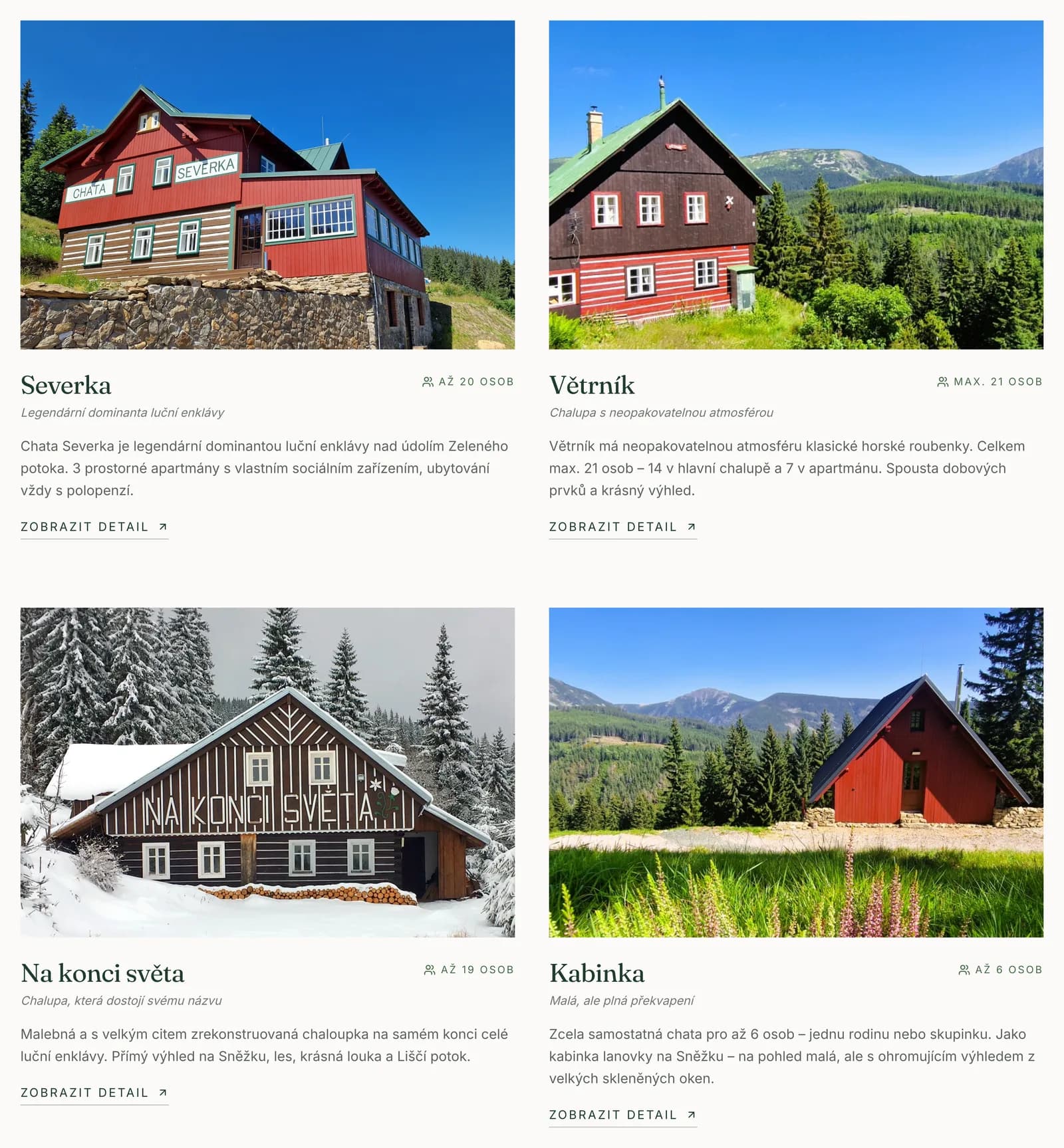
Each of them is a different product. Severka is the largest, with shared spaces and half board. Kabinka is small and sells the view. Větrník is a timber lodge for a big group. Na konci světa sells privacy. A guest looking for a stay for six needs to know which one is theirs — and needs to know it before they reach the third paragraph.
The starting point
The content was fine. Its order wasn't.
The old site had one real advantage worth keeping: years of running it had produced an enormous amount of genuine information. Photographs, history, operating detail, prices, rules. None of it was invented and all of it is useful to somebody.
The problem was the presentation. A single screen held the main claim, a phone number, a list of the four cottages, a list of benefits, a note about half board, a contact form, the history, the rooms, the catering, the ski slopes, the walks and ski touring. The important and the incidental carried the same visual weight, so what you read first was decided not by the site but by chance.
It wasn't that the site was ugly. It was that the guest had to do the searching.
The brief wasn't to write the content again. It was to put it in the order in which people decide.
InterludeThe same homepage
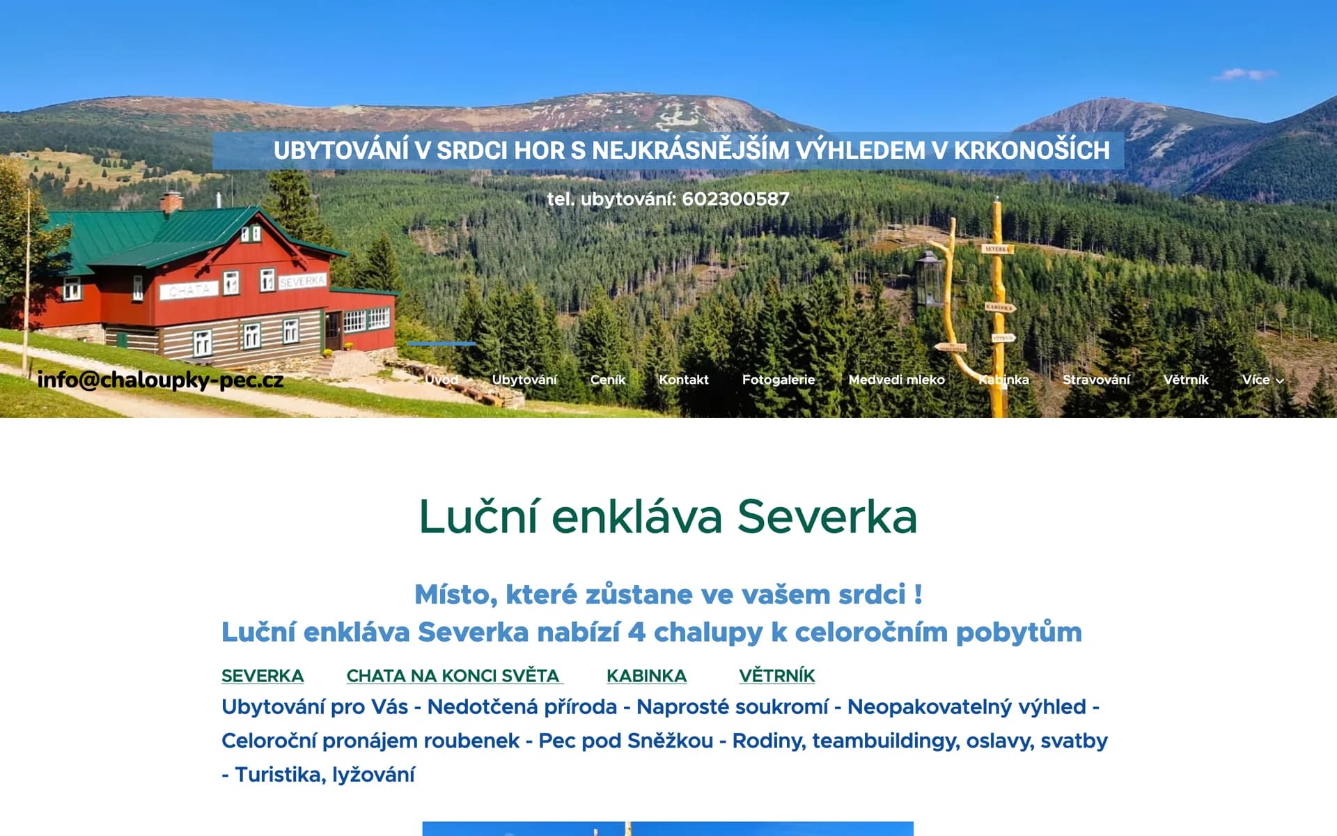
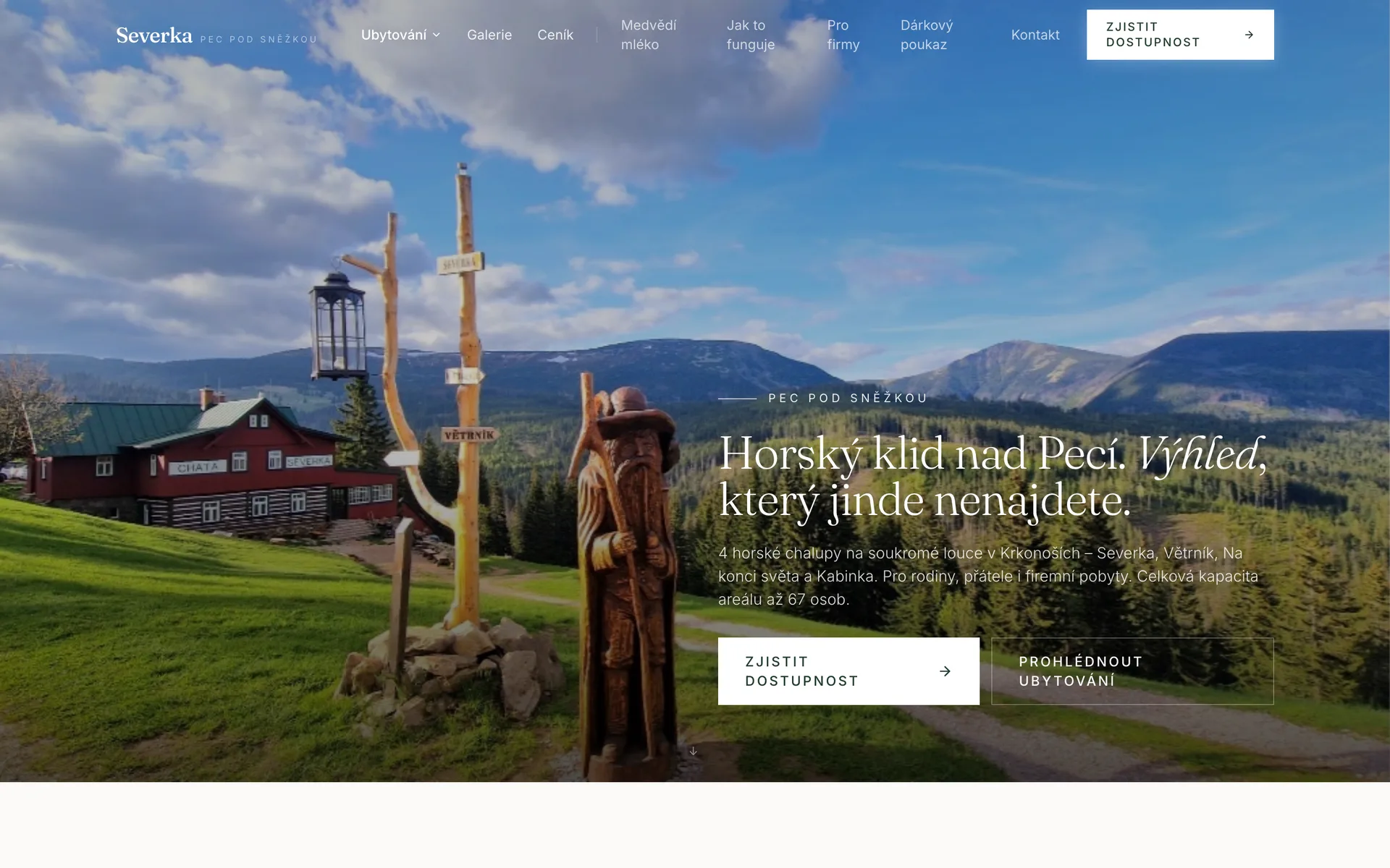
The same place, the same photographs, the same owner. What changes is what you learn first — and whether you know what to do next.
Phase 01Design direction
The client's strongest selling point isn't text. It's the view.
Severka is not an anonymous resort, and a sterile hotel template would have stripped out exactly what it stands on: solitude, timber, the meadow and mountain history. The visual direction came out of that — tradition meeting contemporary hospitality design, in muted natural tones that let the photograph carry rather than compete with it.
Deep forest green as the identity colour, warm cream as the ground, supporting tones of wood and earth. Serif headings carry the character, a clean sans handles operating information and the interface. And between them more empty space than the old site had on its entire homepage.
The main change isn't in the palette, though. It is in what the photograph is for: it stopped being decoration between paragraphs and became the thing that sells. We reset the hero text several times so that it covers neither the main cottage nor the ridgeline — here the hierarchy gave way to the image, not the other way round.
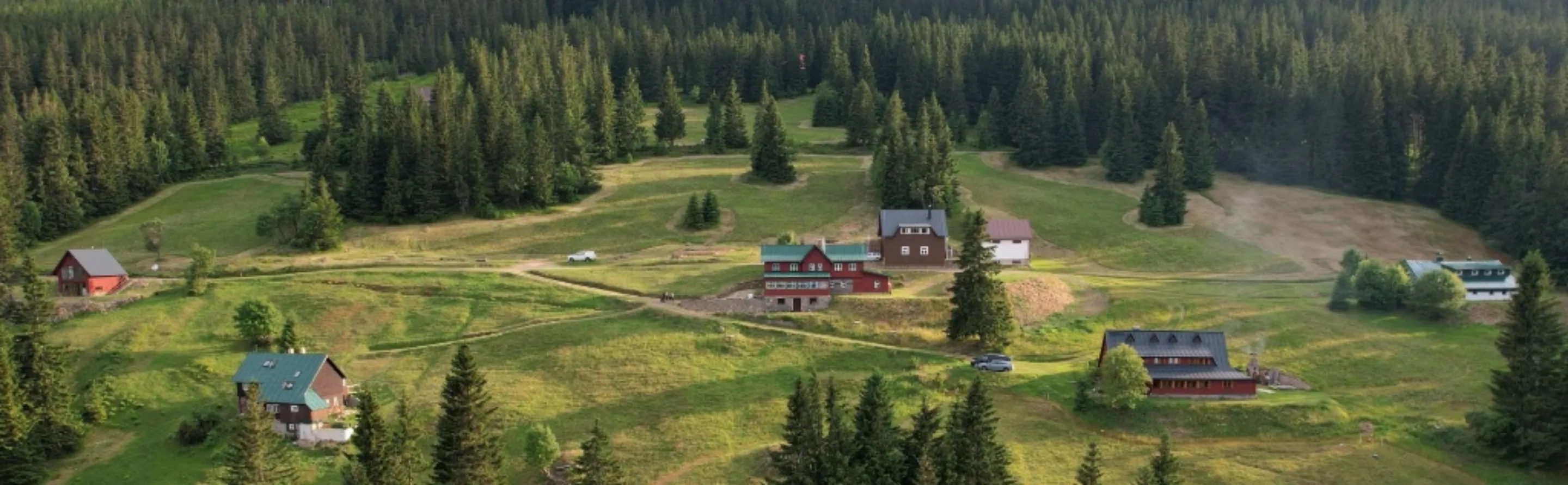 Mountain quiet above Pec.A view you won't find anywhere else.
Phase 02Order
Emotion first. Information second.
The old homepage opened with a written message: heading, claim, phone number, paragraph. The redesign inverts that logic. First we want to show Severka, and only then explain it.
On this job that isn't an aesthetic decision. What is being marketed is not an abstract service that has to be described, but a specific place that only has to be shown. So the large-format photograph was given the whole first screen, and lines like “Mist over the meadow in the morning. Red skies over Sněžka in the evening.” were given room of their own instead of being buried inside a paragraph.
Legibility over the photograph is handled by shading and an overlay, not by a coloured band across half the screen. At the same time the total capacity of the enclave was unified into one number that holds everywhere.
A site that opens by explaining has to earn your attention. A site that opens with the place is given it.
Old order · twelve messages, one weight
- Claim
- Phone
- Four cottages
- Benefits
- Half board
- Form
- Cottage descriptions
- History
- Rooms
- Catering
- Ski slopes
- Walks
Redesign · weight falls with the decision
- 01 Place and view
- 02 Which house is mine
- 03 Price and season
- 04 Check availability
- 05 Practical information
Phase 03Four products
The question the site has to answer is: which cottage is mine?
The redesign changes the role of the individual buildings. A visitor no longer has to read four long descriptions and distil the differences out of them. They should quickly grasp which house matches their kind of stay — and only then start reading the description.
Severka is the main and largest building, with shared spaces and a restaurant serving half board. Kabinka is a smaller standalone cottage for four to six with a striking view. Větrník is a traditional timber lodge suited to larger groups. Na konci světa is a separate cottage with a high degree of privacy and a character of its own.
Above that sits a comparison built around “pick the right cottage in 20 seconds”: capacity, type of stay, half board, privacy. It isn't a table for the sake of a table — it is the one place on the site where the four products can honestly be set side by side.
| Building | Capacity | Sells | Half board |
|---|---|---|---|
| Severka | 20 beds | shared spaces | on site |
| Větrník | 21 people | large groups | from Severka |
| Na konci světa | 9 people | privacy | from Severka |
| Kabinka | 6 people | the view | from Severka |
Half board is served at Severka and is available to guests of all four cottages. One sentence that has to read the same in the price list, in the FAQ and on every page — otherwise the site contradicts itself.
Phase 04Conversion path
The most important change in this job isn't graphic. It's one verb.
The old site used generic contact wording — write to us, get in touch, contact us. The new site uses a more specific and psychologically far lighter action: “Check availability”.
The difference lies in what the visitor feels they are committing to. “Book” sounds like a commitment. “Write to us” sounds like a conversation you have to prepare for. “Check availability” is a question the visitor wants answered as much as the owner does — and it leads into exactly the same form.
The form has five steps: dates from and to, number of people, type of stay, preferred building with an “I don't know, advise me” option, and contact details. It sends a non-binding enquiry. There is no public availability calendar, because Severka really does book by arrangement — and a website shouldn't promise a process that isn't running behind it.
Micro-conversions instead of pressure: look, compare, check the price, check availability, send.
Micro-conversions instead of one big commitment
- look
- compare
- check the price
- check availability
- send
And only then a form of five steps
- 01Dates from – to
- 02Type of stay
- 03A building, or “advise me”
- 04Catering
- 05Contact
No public availability calendar. Severka books by arrangement, and a site shouldn't promise a process that isn't running behind it.
Phase 05Information architecture
We didn't start deleting information. We started layering it.
The client has a great deal of operating information that has to stay on the site — these are conditions, not filler. Cutting the long texts would not have solved the problem, only moved it: whatever disappears from the site gets asked over the phone.
The answer was to split the content into layers according to when a person needs it. Quick information on the main page, detail on the individual cottage's page, an FAQ for recurring questions, a price list for pricing and payment terms, documents for the full legal and operating wording.
Practical information also got a design system of its own: short cards of the same size, each with an icon, a heading and a few lines. The text was fitted to the component, not the component to an arbitrary length of text. The result is a regular grid you can scan with your eyes — and which stacks on a phone without anything falling apart.
Whoever wants the price doesn't have to read the cancellation terms on the way. Whoever wants the cancellation terms can still get to them.
Five layers, by when a person needs them
- Main pagequick informationevery visitor
- Cottage pagedetail of the buildingalready choosing
- FAQrecurring questionsstill hesitating
- Price listprices, seasons, paymentsdoing the maths
- Documentsthe full wording of the termswho needs it in writing
Nothing was deleted. Whoever wants the full terms goes one layer down for them — but doesn't have to read them on the way to the price.
The price list
The price list wasn't a page. It was an Excel sheet photographed into an image.
The old price list carried plenty of important detail: seasons, minimum length of stay, renting individual rooms, children, New Year's Eve, pets, deposits, arrival and cancellation terms. But the prices themselves were not written on that page. They were placed as four images — one Excel sheet photographed for each cottage.
The consequences of that are not aesthetic. No price could be selected, copied or found with an in-page search: not one of the figures appeared as text in the page source. A screen reader read nothing out of those tables. On a phone the image shrank to an illegible size and could only be enlarged by panning. And because an image isn't edited the way text is, Severka's table still showed the 2023–2024 season at a point when the site was offering stays in 2026.
In the redesign the price list broke down into components: a building switcher, season labels, a price table with a secondary per-person-per-night rate, and below it the notes that used to hang under the image as asterisks. The prices are text. They can be searched, they can be copied, a screen reader reads them and on a phone they wrap.
The price list stopped being a document you download with your eyes. It became a tool for deciding.
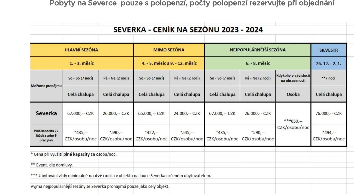
Visible cell gridlines. And the 2023–2024 season on a site offering stays in 2026 — an image isn't edited the way text is.
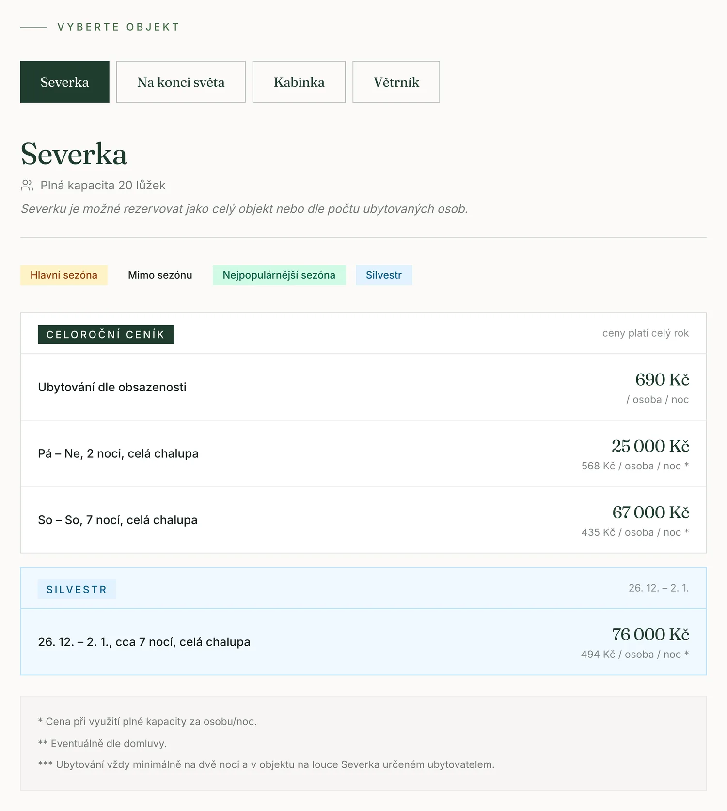
A building switcher, season labels, a price per building and per person per night. All of it text, so it can be searched and copied.
We have that page's source code saved from 14 September 2026. Searching it for the figure 67,000 returns nothing — not once, on the whole page.
Content audit
A good website isn't only handsome. It heads off misunderstandings between guest and owner.
Assembling the FAQ meant going through every repeated piece of information and checking whether it said the same thing everywhere on the site. Often it did not. And these are not typos — they are the things that end in an argument on arrival.
Dogs are the clearest case. The rule is not one rule for the whole enclave: at Severka and Kabinka dogs are not allowed at all, at Větrník and Na konci světa they are possible by prior arrangement, when the whole building is booked, and for a surcharge. The general sentence “dogs by arrangement” is therefore untrue for half the enclave — and a guest who reads it and turns up at Severka with a dog is both right and wrong.
Capacities, half board, check-in and check-out, minimum length of stay and parking were reconciled the same way. Half board is a good example of how one small piece of information carries the credibility of the whole: it is served at Severka and is available to guests of every cottage. That single sentence has to appear identically in the price list, in the FAQ, in the practical information and on every building's page.
The cheapest mistake is the one you find while writing the FAQ. The most expensive is the one a guest finds in the car park.
The general sentence that suggested itself“Dogs are welcome here by prior arrangement.”
- Severkadogs are not allowed
- Kabinkadogs are not allowed
- Větrníkby arrangement, whole building, surcharge
- Na konci světaby arrangement, whole building, surcharge
For two buildings out of four that sentence would be untrue. A guest who reads it and turns up at Severka with a dog is right and wrong at the same time — and it gets settled in the one place where it can no longer be settled.
Getting there
Getting up into the mountains isn't described in general. It's described by season.
The cottages stand in the core zone of the national park, where motor vehicles are generally not allowed. In summer, driving up to the buildings is possible with a permit for specific vehicles and their number may be limited; other cars stay in the car parks in Pec pod Sněžkou. In winter, driving up to the buildings in your own car is not possible. Travel recommendations and current conditions are sent to guests before they arrive.
We also removed wording that could suggest that moving guests up by quad bike or other vehicle is an automatic service included in the price. Where transport is possible, it is arranged individually — and it is better to say so on the website than on the phone the day before arrival.
Segments
Companies, the gift voucher and Medvědí mléko stopped being a footnote.
The enclave can be hired for team building, a company stay, a training camp, a celebration or a wedding. The old site mentioned it; the redesign started selling it in its own right. A corporate visitor isn't only counting rooms — they need to know whether the team will work as one, how much shared space there is, how much privacy, and what there is to do nearby. So groups were given a presentation logic of their own, including the fact that a company stay doesn't require hiring the whole meadow.
One rule goes with that on the imagery: don't show the space, show it being used. An empty common room shows architecture. The same room full of people says team building, a celebration or an evening together — and that is what a corporate client is buying.
The gift voucher got a page of its own and a clear commercial role: it isn't tied to one particular building, its validity is always stated on the voucher issued, dates are subject to availability, a more expensive stay means paying the difference, and on a cheaper one the unused part isn't refunded. It is presented as a gift, not as legal text.
And Medvědí mléko — the house drink, bear's milk — together with Severka's history was given room away from the operating information. In a month's time nobody will remember whether the cottage had a dishwasher. They may well remember the place below Sněžka where they drank Medvědí mléko.
What we don't claim
You won't find a single percentage in this study. That is deliberate.
The new site is built as a component-based, responsive application that handles forms, accordions, galleries and calls to action differently from the old page. That is a description of what was built, and you can verify it by looking.
What cannot be verified, we will not claim. Without a Lighthouse measurement we won't write that the site is X % faster. Without analytics we won't write that engagement went up. Without data from live operation we won't write anything about conversion rate. Numbers like that only mean something once the site is live and measured — until then they are marketing, not a result.
What can legitimately be said is this: the redesign was drawn up to shorten the path to an enquiry, to make it easier to tell the four buildings apart, and to reconcile information that contradicted itself on the old site. Whether it worked will show in operation.
In closing
This wasn't a new design for a website. It was a redesign of the customer's path.
At first glance the difference between the two sites is obvious: more modern typography, a different use of photography, more space, cleaner components, consistent colour. That is the easy part and it shows from a thumbnail.
The real work happened underneath. It meant understanding how four different buildings operate, who books them, how summer differs from winter, how you get up there, where half board is served, where a dog may stay, how the voucher is sold, what the core zone of a national park means and why the price list went two years without being rewritten. Only with all of that can you decide what someone sees first and what they see twentieth.
The most valuable thing about the old site was its content, and that stayed. The redesign added hierarchy, a visual identity, a conversion path, visitor segmentation and a single source of truth for the information that repeats.
We didn't change Severka. We changed the way a person meets it on the internet.
Method
What you won't find in this study.
Prices, the scope of the engagement, or the client's internal figures. And no percentage for speed, engagement or conversions — those cannot be claimed without measurement in live operation. The redesign you can walk through yourself. We don't offer a link to the old site: the redesign is taking over its domain, so the link would lead to exactly what the study argues against. Claims about the starting point therefore rest on an archive we made on 14 September 2026 — captures of all eleven pages, source code included.
Does your website make the guest do the searching?
Tell us about your project, or first work out what a system of your own would save you.